Player iOS
I designed an iOS app that improved mobile deployment experience for frontline workers. An iOS mobile app transformed from the Player web app, adhering to Apple's guidelines and focusing on inclusivity.

Overview
My Role
Product designer. Owned end-to-end design hand-off. Collaborated with my mentor/manager and senior engineers.
The Challenge
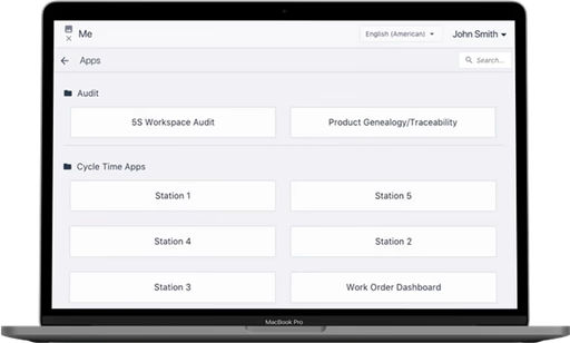
The Player app existed only as a web app and a poorly designed Android app. The mobile UI was basically the same as the web UI, not mobile-friendly and lacking basic functionality and usability.
Timeline
- 1 month
- From web to iOS mobile app
Outcome
- Five-star App Store reviews
- Improved mobility, flexibility and connectivity
- Accepted to the Apple App Store
Context
Tulip Interfaces is a low-code app-building platform for manufacturers
Users use Tulip to deploy customized apps that connect the people, machines, devices, and systems used in a production process. Tulip Player is the application for operators to run these apps. Having an iOS mobile app allows users to deploy their Tulip apps anytime, anywhere.
Tulip Player is an application for operators to run Tulip apps. These apps are created on the “App Editor” Page. Once installed on a device and configured by a user with “create” permissions for Stations, it can run the set of apps.
Having an iOS mobile app allows users to deploy their Tulip apps anytime, anywhere. This mobile app has long been requested by our end users, due to connectivity and mobility issues.
Problem Statement
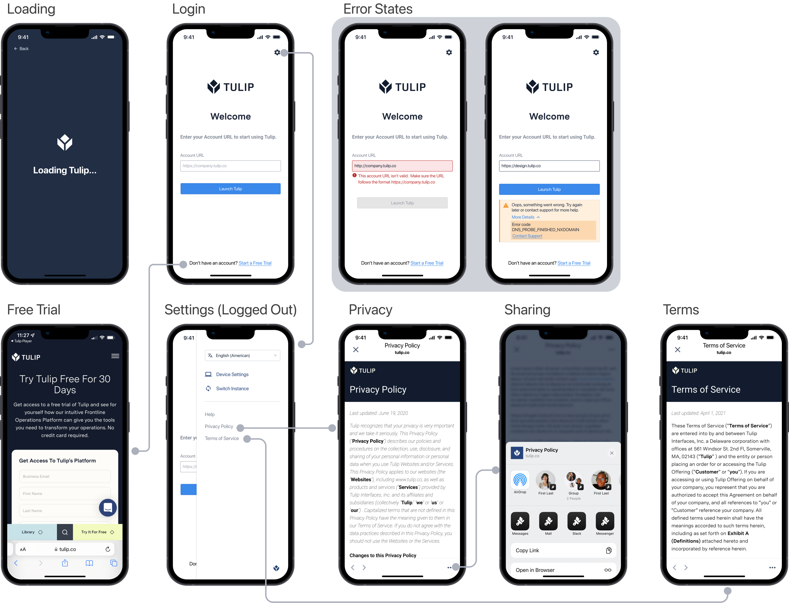
How do we redesign the Tulip Player web app for iOS mobile devices?
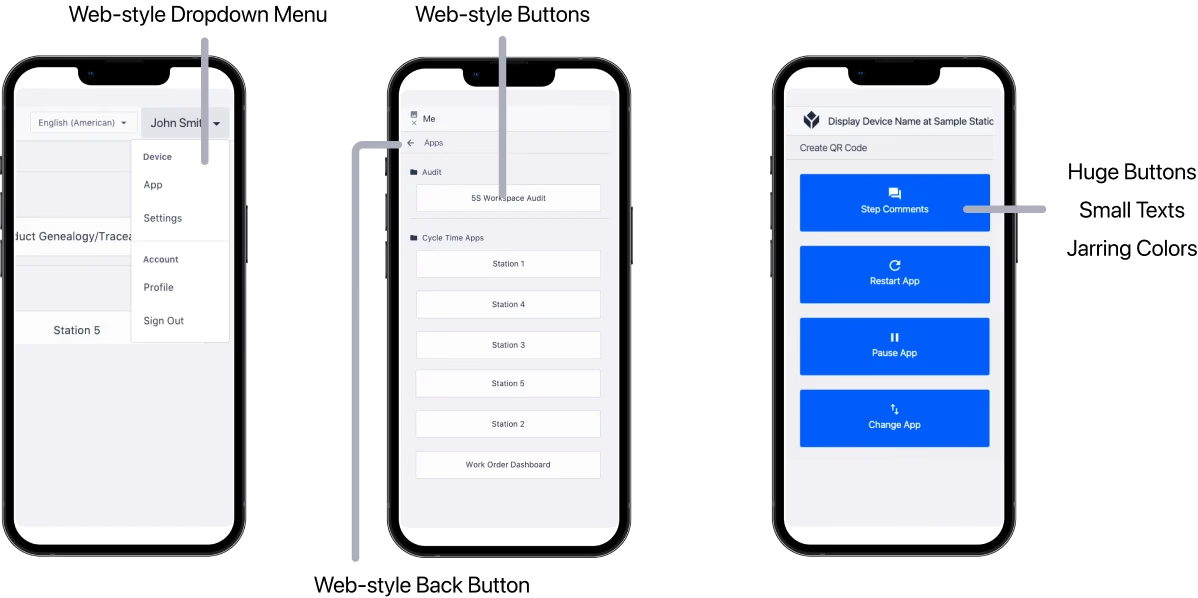
Current Mobile Design
- The Player app exists as a web app and an Android app
- The mobile UI is the same as the web, not mobile-friendly
- Lacks basic functionality and usability
From web to mobile in a month
- Adhere to Apple Store design guidelines
- Focus on transforming the Player web app into iOS
- Minimizing the engineering effort required

A long-time user request for an iOS native app
Users requested an iOS app due to connectivity and mobility issues with the web-based Player.
Process
Considering our unique user group - frontline workers
Factory workers usually wear gloves, making touch interaction difficult. They frequently log in and out as shifts change. 70% of users are men, and nearly 10% are colorblind. Mobile UI prioritizes concise content, simplified navigation, and thumb-friendly touch targets.
Understanding mobile UX
Iteraction Pattern
Depending on the way people hold their devices and the size of their hands, the hand-reach comfort zone is different for everyone. The middle area is usually the best way to go.
Keep it Simple
Reducing cognitive load means streamlining the design and content, removing any unnecessary elements that may cause confusion.
Small Screen Size, Single Task
Take the Apple Map as an example. If I'm navigating, most of my screen is the map itself. When I search for places, I swipe up to type in the location.

Iterations
Making Design Decisions
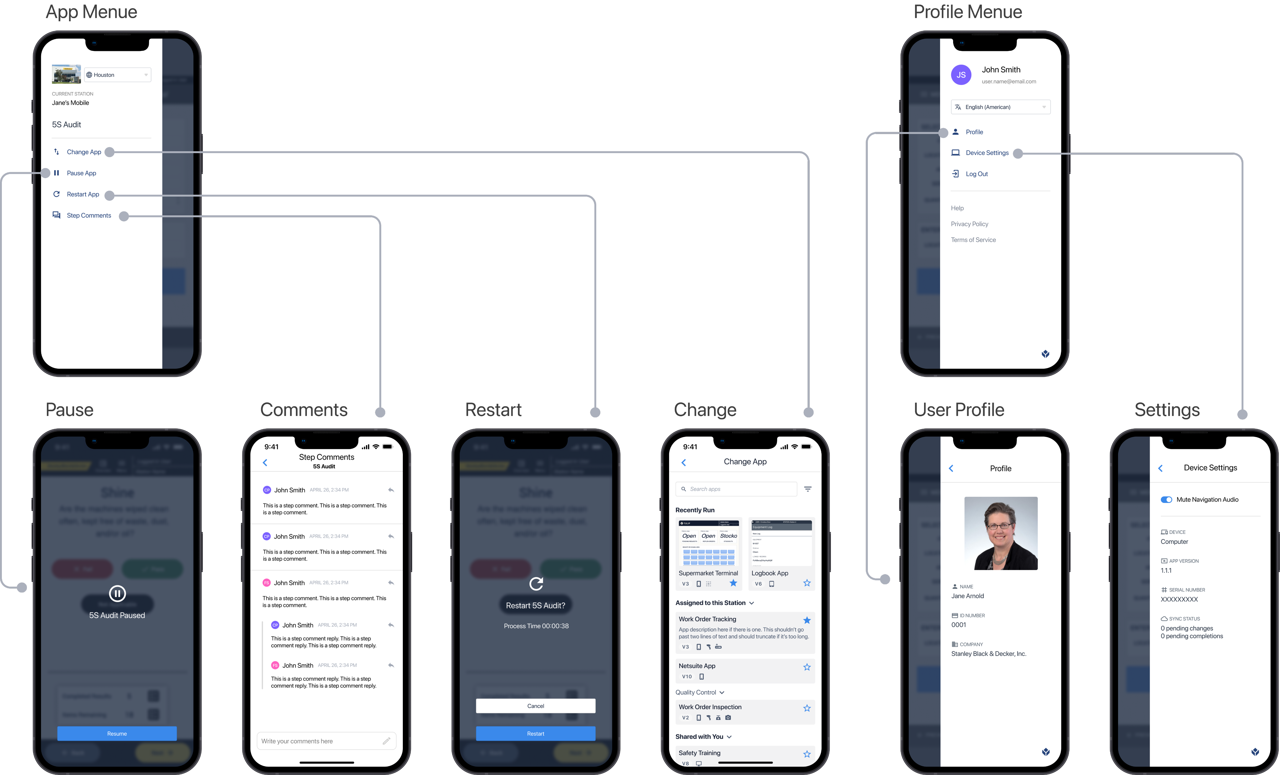
Decision 1: Button Placement with Color-coding
Readability and Reachability
Factory workers may need to operate the app with one hand while performing tasks or holding equipment. Large buttons placed in the center ensure easy reachability.
Reducing Cognitive Load
Color-coding buttons with different functions help users quickly distinguish between them, crucial in fast-paced factory environments. This reduces cognitive load.
Less is More
By limiting the number of buttons and focusing on the most critical functions, this contributes to a streamlined, easy-to-navigate interface for minimal effort.
Decision 2: Swipe for App Menu
Accessibility
Swiping is a more forgiving gesture compared to tapping, which requires a higher level of precision. Users wearing gloves, having limited dexterity will find swiping easier to perform.
Ergonomics
Swiping is a natural and comfortable motion, especially for one-handed use. It can reduce the strain on users' hands and fingers by minimizing the need for repetitive tapping.
Lacks Discoverability? Designing for Edge Cases
Normally, within users' customized apps, there should be a menu button that leads to the App menu overlay. However, during edge case testing, we discovered that if a user forgets to include a menu button when designing the app, they will become stuck with no way to quit the app. Therefore, this swipe menu serves more as a backup plan. We do not want to include an additional menu icon that could confuse users, so this design is our best option.
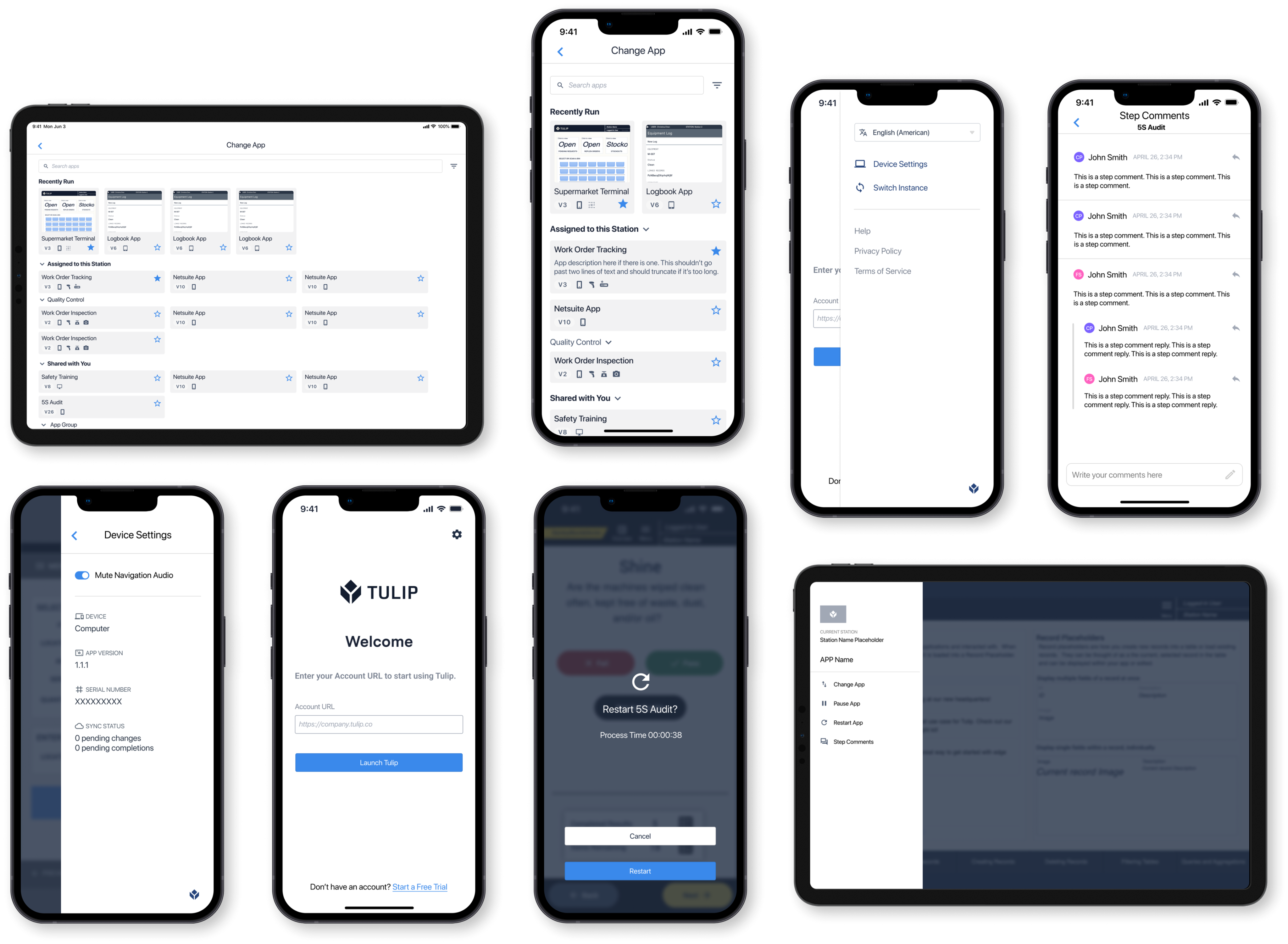
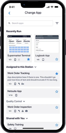
Final Design
Final design
After receiving both internal and end-user feedback, we took the time to once again brainstorm and thoroughly consider the user's perspective and ultimately arrived at the final version of the design.
Player iOS
I designed an iOS app that improved mobile deployment experience for frontline workers. An iOS mobile app transformed from the Player web app, adhering to Apple's guidelines and focusing on inclusivity.

Overview
My Role
Product designer. Owned end-to-end design hand-off. Collaborated with my mentor/manager and senior engineers.
The Challenge
The Player app existed only as a web app and a poorly designed Android app. The mobile UI was basically the same as the web UI, not mobile-friendly and lacking basic functionality and usability.
Timeline
- 1 month
- From web to iOS mobile app
Outcome
- Five-star App Store reviews
- Improved mobility, flexibility and connectivity
- Accepted to the Apple App Store
Context
Tulip Interfaces is a low-code app-building platform for manufacturers
Users use Tulip to deploy customized apps that connect the people, machines, devices, and systems used in a production process. Tulip Player is the application for operators to run these apps. Having an iOS mobile app allows users to deploy their Tulip apps anytime, anywhere.
Tulip Player is an application for operators to run Tulip apps. These apps are created on the “App Editor” Page. Once installed on a device and configured by a user with “create” permissions for Stations, it can run the set of apps.
Having an iOS mobile app allows users to deploy their Tulip apps anytime, anywhere. This mobile app has long been requested by our end users, due to connectivity and mobility issues.
Problem Statement
How do we redesign the Tulip Player web app for iOS mobile devices?
Current Mobile Design
- The Player app exists as a web app and an Android app
- The mobile UI is the same as the web, not mobile-friendly
- Lacks basic functionality and usability
From web to mobile in a month
- Adhere to Apple Store design guidelines
- Focus on transforming the Player web app into iOS
- Minimizing the engineering effort required
A long-time user request for an iOS native app
Users requested an iOS app due to connectivity and mobility issues with the web-based Player.
Process
Considering our unique user group - frontline workers
Factory workers usually wear gloves, making touch interaction difficult. They frequently log in and out as shifts change. 70% of users are men, and nearly 10% are colorblind. Mobile UI prioritizes concise content, simplified navigation, and thumb-friendly touch targets.
Understanding mobile UX
Iteraction Pattern
Depending on the way people hold their devices and the size of their hands, the hand-reach comfort zone is different for everyone. The middle area is usually the best way to go.
Keep it Simple
Reducing cognitive load means streamlining the design and content, removing any unnecessary elements that may cause confusion.
Small Screen Size, Single Task
Take the Apple Map as an example. If I'm navigating, most of my screen is the map itself. When I search for places, I swipe up to type in the location.

Iterations
Making Design Decisions
Decision 1: Button Placement with Color-coding
Readability and Reachability
Factory workers may need to operate the app with one hand while performing tasks or holding equipment. Large buttons placed in the center ensure easy reachability.
Reducing Cognitive Load
Color-coding buttons with different functions help users quickly distinguish between them, crucial in fast-paced factory environments. This reduces cognitive load.
Less is More
By limiting the number of buttons and focusing on the most critical functions, this contributes to a streamlined, easy-to-navigate interface for minimal effort.
Decision 2: Swipe for App Menu
Accessibility
Swiping is a more forgiving gesture compared to tapping, which requires a higher level of precision. Users wearing gloves, having limited dexterity will find swiping easier to perform.
Ergonomics
Swiping is a natural and comfortable motion, especially for one-handed use. It can reduce the strain on users' hands and fingers by minimizing the need for repetitive tapping.
Lacks Discoverability? Designing for Edge Cases
Normally, within users' customized apps, there should be a menu button that leads to the App menu overlay. However, during edge case testing, we discovered that if a user forgets to include a menu button when designing the app, they will become stuck with no way to quit the app. Therefore, this swipe menu serves more as a backup plan. We do not want to include an additional menu icon that could confuse users, so this design is our best option.
Final Design
Final design
After receiving both internal and end-user feedback, we took the time to once again brainstorm and thoroughly consider the user's perspective and ultimately arrived at the final version of the design.