Admin dashboard
Led end-to-end design of the admin dashboard, improving efficiency through enhanced navigation, faster information access, and streamlined key actions. Also contributed to iOS app improvements for frontline worker mobile deployment.

Context
Tulip is switching to usage based pricing
Tulip Interfaces is a low-code app building platform for frontline operations. Users deploy customized apps that connect the people, machines, devices, and systems used in a production or logistics process in a physical location.
New design is needed because we switched to Usage Based Pricing. The price customer pays is based on consumption. Therefore, we want to introduce a feature to visualize account usage. This helps users understand what they are paying for and, most importantly, why they might need more from Tulip.
Problem and Opportunity
Admin users need a dashboard for account overview
Project scope: Create a non-customizable MVP version of the homepage dashboard with only the essential information for the two types of admin users.
Currently, this comprehensive homepage/dashboard does not exist, and existing workarounds do not provide the same level of efficiency and overview for managing Tulip App deployment in factories.
- Account settings page
- Limited information
- Low discoverability and hard to navigate
- Poor data visualization
- Dashboard per request
- Non-interactive PDF files
- Time-consuming to make
- Only available for large enterprise users
3. Third-party platforms
- Customers track on their own system
- Loses users to third-party platforms
- Inefficient and error-prone
Research
We first defined users and learned common design approach
There are two types of users for this feature: #1 Executives, who focus on high-level decisions and want alerts for abnormal trends, overall manufacturing status, and Tulip usage; #2 Account Admins, who prioritize usage details, seeking manufacturing alerts, approval requests from operators, and workspace data such as the number of workspaces and their status.
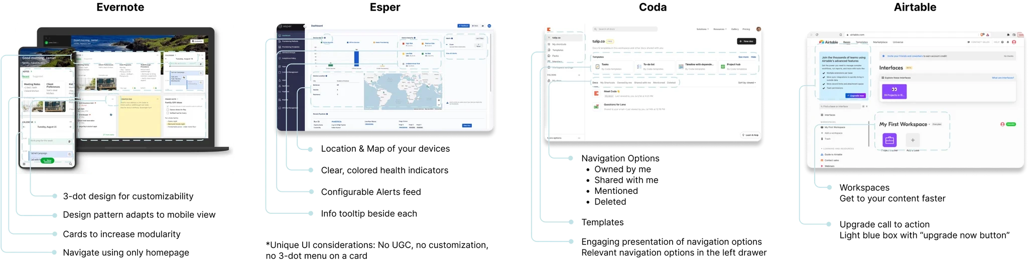
We researched similar homepage features with the PM. While not direct competitors, these sites share a commonality: they all utilize data. Our analysis revealed patterns that we can incorporate into our design.
Design and Iterations
Designing a modular homepage that offers clear hierarchy
Modular & Accessible Design
Since this is an MVP version, we want modules that can be easily modified in the future. Users can also navigate the platform from this page.
Key Metrics Visualization
The bird's-eye views are for the executives, while the data drill-downs are for the more technical account admins.
Organized Information Hierarchy
There are three key components in the data: user, station, and apps. We want to incorporate an interactive map, alerts, and health indicators.
Iteration #1
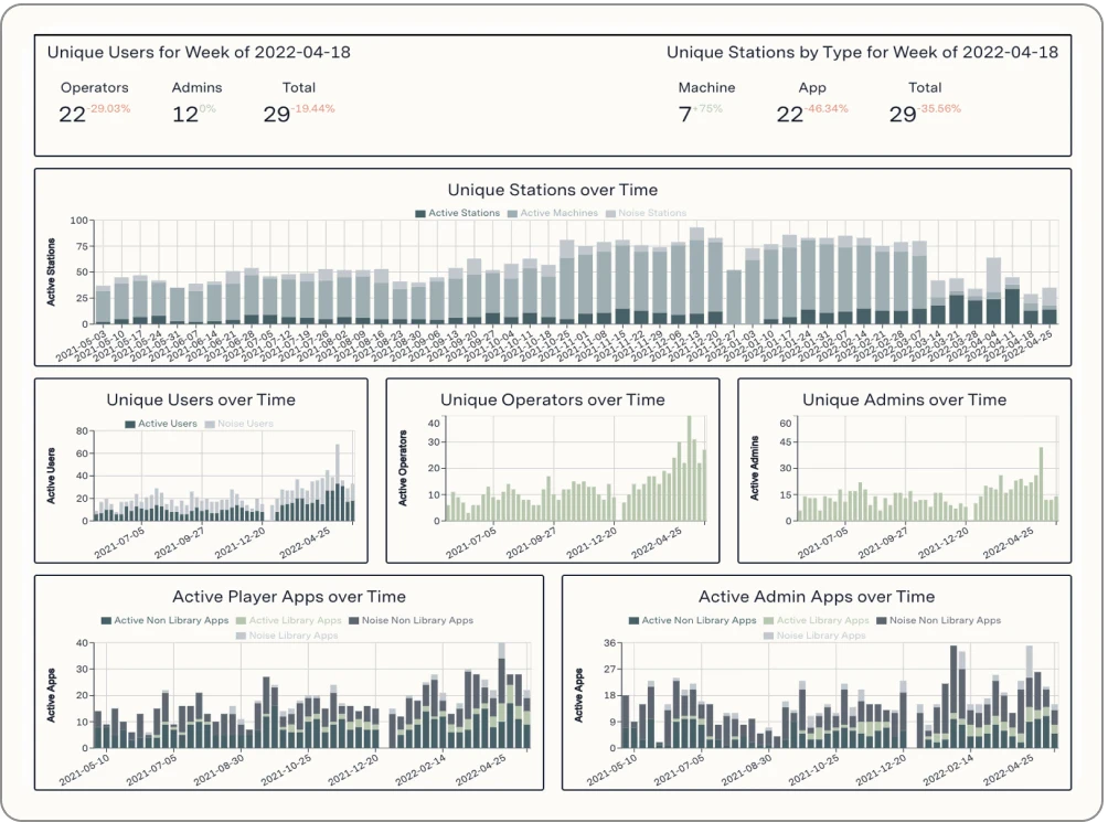
The modular card design effectively visualizes metrics, allowing users to click and explore data. However, the inconsistent color scheme, click and show interaction, and time selection feature can confuse users.
Iteration #2
This design enhances readability by organizing information into three sections with a cohesive color scheme. Users can customize the time frame and visual style, but we need to simplify navigation across multiple workspaces to reduce confusion.

Process and Iterations
Final design
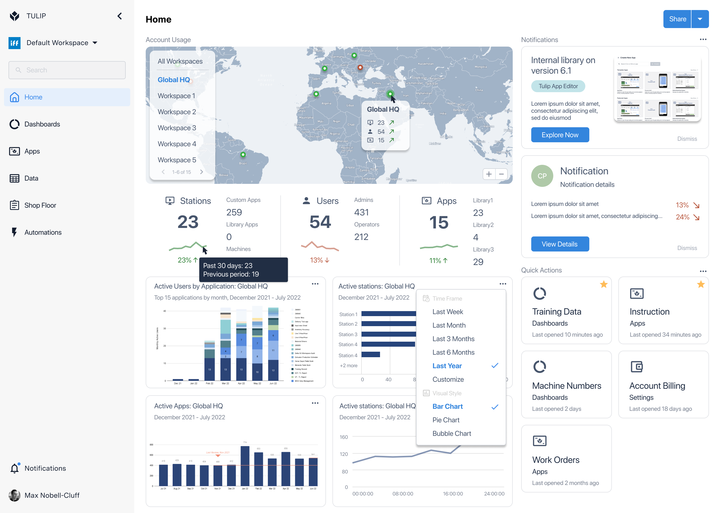
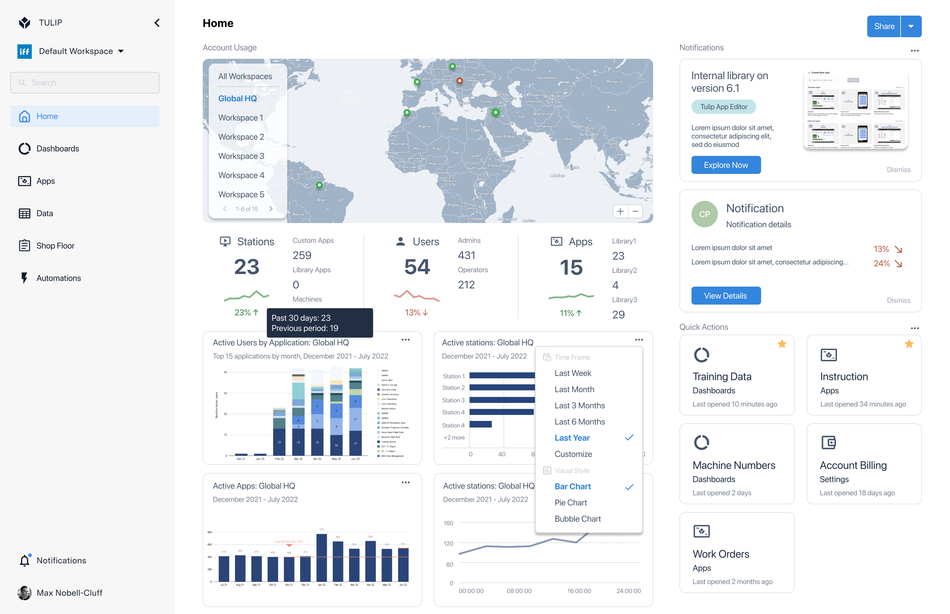
After considering user feedback, I rethought the layout to highlight key account usage information, relocating notifications and shortcuts for easier access. I added hover details for workspaces, enabling users to quickly see which ones need attention. Individual filters for each graph replaced the single top filter, enhancing user control. Action buttons for alerts were added, and shortcuts were moved to the bottom right for a more streamlined experience.
Admin dashboard
Led end-to-end design of the admin dashboard, improving efficiency through enhanced navigation, faster information access, and streamlined key actions. Also contributed to iOS app improvements for frontline worker mobile deployment.

Context
Tulip is switching to usage based pricing
Tulip Interfaces is a low-code app building platform for frontline operations. Users deploy customized apps that connect the people, machines, devices, and systems used in a production or logistics process in a physical location.
New design is needed because we switched to Usage Based Pricing. The price customer pays is based on consumption. Therefore, we want to introduce a feature to visualize account usage. This helps users understand what they are paying for and, most importantly, why they might need more from Tulip.
Problem and Opportunity
Admin users need a dashboard for account overview
Project scope: Create a non-customizable MVP version of the homepage dashboard with only the essential information for the two types of admin users.
Currently, this comprehensive homepage/dashboard does not exist, and existing workarounds do not provide the same level of efficiency and overview for managing Tulip App deployment in factories.
- Account settings page
- Limited information
- Low discoverability and hard to navigate
- Poor data visualization
- Dashboard per request
- Non-interactive PDF files
- Time-consuming to make
- Only available for large enterprise users
3. Third-party platforms
- Customers track on their own system
- Loses users to third-party platforms
- Inefficient and error-prone
Research
We first defined users and learned common design approach
There are two types of users for this feature: #1 Executives, who focus on high-level decisions and want alerts for abnormal trends, overall manufacturing status, and Tulip usage; #2 Account Admins, who prioritize usage details, seeking manufacturing alerts, approval requests from operators, and workspace data such as the number of workspaces and their status.
We researched similar homepage features with the PM. While not direct competitors, these sites share a commonality: they all utilize data. Our analysis revealed patterns that we can incorporate into our design.
Design and Iterations
Designing a modular homepage that offers clear hierarchy
Modular & Accessible Design
Since this is an MVP version, we want modules that can be easily modified in the future. Users can also navigate the platform from this page.
Key Metrics Visualization
The bird's-eye views are for the executives, while the data drill-downs are for the more technical account admins.
Organized Information Hierarchy
There are three key components in the data: user, station, and apps. We want to incorporate an interactive map, alerts, and health indicators.
Iteration #1
The modular card design effectively visualizes metrics, allowing users to click and explore data. However, the inconsistent color scheme, click and show interaction, and time selection feature can confuse users.
Iteration #2
This design enhances readability by organizing information into three sections with a cohesive color scheme. Users can customize the time frame and visual style, but we need to simplify navigation across multiple workspaces to reduce confusion.

Process and Iterations
Final design
After considering user feedback, I rethought the layout to highlight key account usage information, relocating notifications and shortcuts for easier access. I added hover details for workspaces, enabling users to quickly see which ones need attention. Individual filters for each graph replaced the single top filter, enhancing user control. Action buttons for alerts were added, and shortcuts were moved to the bottom right for a more streamlined experience.
Admin dashboard
Led end-to-end design of the admin dashboard, improving efficiency through enhanced navigation, faster information access, and streamlined key actions. Also contributed to iOS app improvements for frontline worker mobile deployment.

Context
Tulip is switching to usage based pricing
Tulip Interfaces is a low-code app building platform for frontline operations. Users deploy customized apps that connect the people, machines, devices, and systems used in a production or logistics process in a physical location.
New design is needed because we switched to Usage Based Pricing. The price customer pays is based on consumption. Therefore, we want to introduce a feature to visualize account usage. This helps users understand what they are paying for and, most importantly, why they might need more from Tulip.
Problem and Opportunity
Admin users need a dashboard for account overview
Project scope: Create a non-customizable MVP version of the homepage dashboard with only the essential information for the two types of admin users.
Currently, this comprehensive homepage/dashboard does not exist, and existing workarounds do not provide the same level of efficiency and overview for managing Tulip App deployment in factories.
- Account settings page
- Limited information
- Low discoverability and hard to navigate
- Poor data visualization
- Dashboard per request
- Non-interactive PDF files
- Time-consuming to make
- Only available for large enterprise users
3. Third-party platforms
- Customers track on their own system
- Loses users to third-party platforms
- Inefficient and error-prone
Research
We first defined users and learned common design approach
There are two types of users for this feature: #1 Executives, who focus on high-level decisions and want alerts for abnormal trends, overall manufacturing status, and Tulip usage; #2 Account Admins, who prioritize usage details, seeking manufacturing alerts, approval requests from operators, and workspace data such as the number of workspaces and their status.
We researched similar homepage features with the PM. While not direct competitors, these sites share a commonality: they all utilize data. Our analysis revealed patterns that we can incorporate into our design.
Process and Iterations
Designing a modular homepage that offers clear hierarchy
Modular & Accessible Design
Since this is an MVP version, we want modules that can be easily modified in the future. Users can also navigate the platform from this page.
Key Metrics Visualization
The bird's-eye views are for the executives, while the data drill-downs are for the more technical account admins.
Organized Information Hierarchy
There are three key components in the data: user, station, and apps. We want to incorporate an interactive map, alerts, and health indicators.
Iteration #1
The modular card design effectively visualizes metrics, allowing users to click and explore data. However, the inconsistent color scheme, click and show interaction, and time selection feature can confuse users.
Iteration #2
This design enhances readability by organizing information into three sections with a cohesive color scheme. Users can customize the time frame and visual style, but we need to simplify navigation across multiple workspaces to reduce confusion.
Final Design
Final design
After considering user feedback, I rethought the layout to highlight key account usage information, relocating notifications and shortcuts for easier access. I added hover details for workspaces, enabling users to quickly see which ones need attention. Individual filters for each graph replaced the single top filter, enhancing user control. Action buttons for alerts were added, and shortcuts were moved to the bottom right for a more streamlined experience.